Be A Better Designer With Gestalt Principles, Part 3 - Grouping
In part one and part two of this series, I looked at the figure/ground and similarity Gestalt principle. In this post I’ll be looking at the Gestalt principles related to grouping elements (proximity and uniform connectedness) and how you can use them to improve your designs.
Uniform Connectedness: The Strongest Form of Grouping
The idea behind uniform connectedness is simple: to make things appear as though they belong together, enclose them in a box or some other container (called enclosure), or connect them with lines.
Enclosure
Let’s take a look at some examples of using enclosure to group elements.
Social media posts

There are multiple examples of enclosure in each Facebook post. For example, in Figure 1:
- The entire post is in a white box (it’s clear that this entire thing is a single unit).
- The video title and video are enclosed in a grey box (it’s clear the title is for the video). This isn’t actually part of the Facebook page layout, but is another example of enclosure.
- The thumbs up icon and “Like Page” are in a grey box (associating the thumbs up icon with the action of liking the page).
- The Like, Comment, and Share buttons are enclosed in the white box for the post (it’s clear the actions relate to the post).
- The smiley face (emoji), camera, GIF, and sticker icons are all enclosed in the comment box.
Article sites
I used Boxes and Arrows in part 2 of this series as a good example of using similarity. The site also provides a clear example of how to use enclosure to separate articles from one another.

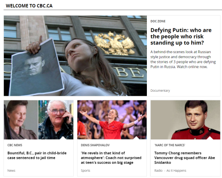
Another good example of enclosing articles can be found on the CBC website (Canada’s national broadcaster).
Sign-up Forms
It’s common practice to put sign up forms in boxes. For example, Google’s account creation form:

It’s also very common to see newsletter subscription forms in boxes. For example, here’s Creative Bloq’s newsletter sign up:

And here’s UX Booth’s:

Navigation
Navigation is arguably one of the most important parts of any site, and also one of the places where enclosure is used most often.
First we’ll look at ABC’s top navigation menu:

ABC uses a thin tan line underneath the menu to separate the navigation bar from the content, effectively grouping the elements above the line.
Dell uses a similar technique except they have a multi-line menu, all of which is enclosed in a large blue box:

In addition to enclosing their content in a blue box, notice how Dell uses a shadow to create a figure/ground relationship within the blue box? The drop shadow makes it seem as though the menu on top (which includes the search bar) is physically in front of the menu below, placing more visual importance on the top menu.
Finally, let’s look at Virgin:
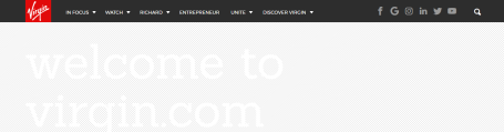
Their enclosure isn’t a traditional box with lines, but an entire boxed area that encloses the menu and contrasts with all other elements on the page. This is particularly important here because this is a sticky menu (when you scroll, it stays at the top of the viewport).
Logos
There are a tremendous number of companies that use enclosure in their logos.
Enclosing a logo makes it clear what is part of the logo, and what is not. Nivea’s enclosed logo makes it very easy to pick the logo out of the hero banner:
Our ThinkUX logo also uses enclosure. We enclose the UX in a thought bubble:
![]()
In addition to enclosure, our logo conveys uniform connectedness by connecting the words “think” and “UX” using thought bubbles. Even though the bubbles aren’t a solid line, they have good continuation and are perceived to connect the elements. This demonstrates the other technique used to convey uniform connectedness: connecting elements.
Connecting Elements
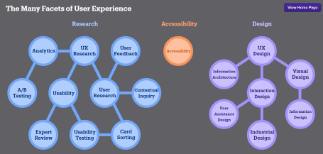
Using lines (or thought bubbles, in our case) to connect elements is less common in web design than enclosure but it is still a useful tool to have in your toolbox. Here’s an infographic from UX Matters that demonstrates linear connectedness:
Another Gestalt principle that can be used to convey relatedness is proximity.
Proximity
Proximity is another powerful way to express that elements are grouped together. The principle of proximity states:
Objects that are closer together are perceived as more related than objects that are further apart.
Proximity isn’t as powerful as uniform connectedness, but is still a very useful technique for grouping, and can be very aesthetically pleasing. The appropriate (or inappropriate) use of whitespace is an excellent way to convey relatedness.
Whitespace
I created a mockup of a site that sells cruises to illustrate poor and good usage of whitespace side by side:
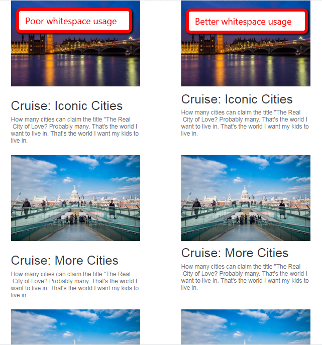
In the “Poor whitespace usage” example on the left, the spacing between the text and the images is almost equal. The user has to work hard to figure out which picture is associated with which cruise. The middle picture could be for either the Iconic Cities cruise or the More Cities cruise. In “Better whitespace usage” example on the right, by simply moving the text closer to the associated picture, it becomes more clear that the text is related to the the picture above the text.
Error messages
Despite having excellent guidelines for how to handle providing feedback for form errors, many companies still do not use proximity to indicate where errors occurred. For example, look at how Netflix handles an incorrect password:
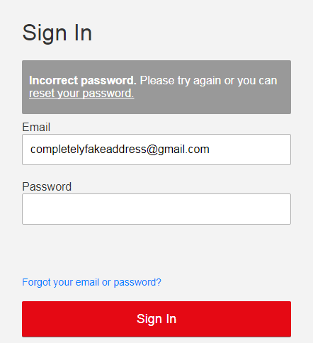
The error message is far away from where the error occurred (the password field). Google demonstrates a much better use of proximity:
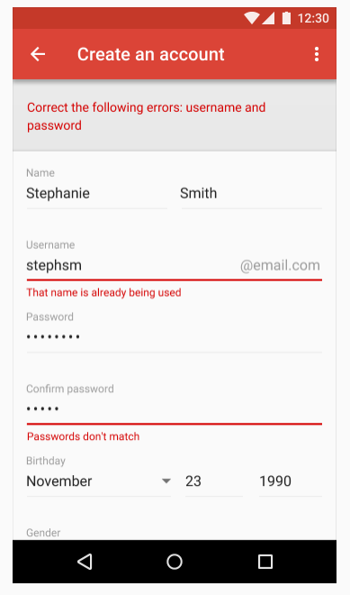
Notice how a summary of the errors is displayed at the top of the form, and then individual messages appear directly underneath each field containing an error. Each of these error messages is closer to the field that it’s related to than to the next field in the form, so it’s clear which field the error message is related to.
TL;DR
Grouping can be achieved using the Gestalt principles of uniform connectedness and proximity. Uniform connectedness is one of the strongest forms of grouping and is achieved by putting related elements in a box (or other shape), or by connecting elements with lines. Proximity states that people perceive elements that are close together to be more related than elements that are farther apart. Whitespace is one of the best ways to convey proximity.
If you with to learn more about grouping using uniform connectedness and proximity, Smashing Magazine and Andy Rutledge are excellent resources.
To cement this idea, you need to practice. Take five minutes and visit your favourite sites and look at how they use uniform connectedness and proximity to group design elements. Good luck, and design on.