Be A Better Designer With Gestalt Principles, Part 2 - Similarity
In part one of this series, I looked at the figure/ground Gestalt principle. In this post I’ll be looking at the principle of similarity, and how you can use it to become a better designer.
The principle of similarity states that things that share similar visual characteristics are perceived to be more related than things that are dissimilar. The three most common characteristics used to create similarity are colour, shape, and size. There are other characteristics like texture, orientation, and dimension, but they aren’t as common, and in most cases aren’t as important.
Examples of Similarity
Similarity and consistency are two sides of the same coin. Making elements look similar to convey that they’re going to do the same thing, or are somehow related, is often a matter of being consistent in style. Your links should look the same. Your CTAs should look the same. Sections of your site that are related should look the same. In general, if you’re consistent (even if you’re consistently bad), people will learn what to look for and how to use your interface.
Let’s look at some examples of popular UX sites, and how they use colour, shape, and size to convey similarity.
Smashing Magazine
Let’s examine how Smashing Magazine (SM) uses the principle of similarity in their links and calls to action.
Links
There are two distinct types of links used on the Smashing Magazine landing page. Links in the content, and navigation links.
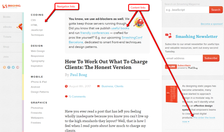
Content Links
Let’s start by looking at the links in the page content:
- Links in the body copy are light blue, underlined in grey.
- The name of each post’s author is slightly larger, and light blue.
- The tags and comments are obviously links (same light blue) even though they aren’t underlined.
If you scroll down the page, the links are consistent. You can immediately identify each of these kinds of links as you scan the page.
Navigation Links
The links in the left hand navigation menu are grouped using colour and typography.

Top level categories (Coding, Design, Mobile, etc.) are are dark grey, written in all capitals, and have a heavier font weight. Sub-categories are lighter grey, have only the first letter of each word capitalized, and have a normal font weight. Additionally, colour is used to separate the categories. When a link is hovered, the bar to the left of the category contents becomes more pronounced, making the category hierarchy clear.
The headings for each post are the largest font, with the heaviest weight. Even though you can only see one post in this image, it’s clear that it’s a blog heading. Even if you scroll down the page at breakneck speed, you can identify the individual posts by their headings. Large size, dark colour: they’re headings!
Calls to Action
One last thing to note here is how SM has two button styles for calls to action (CTA) on their homepage: a red button for search and subscribe, and blue buttons whose text ends with an ellipsis (“…”).
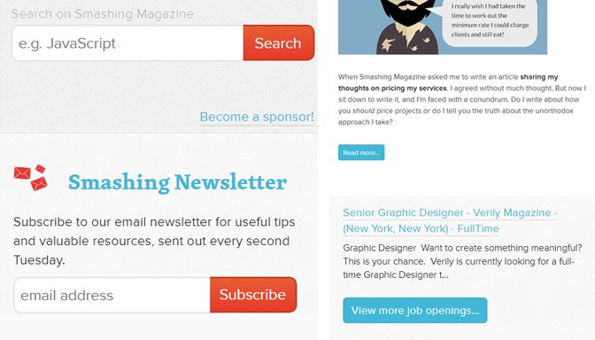
The red buttons for search and subscribe are attached to input boxes, and make actions happen immediately.
The blue buttons are to learn more about whatever content they are below. Even though the blue buttons are located in different places (in the main body and on the right hand side), they are styled the same way. This allows users to discover and understand that blue buttons with ellipses will take them to pages with more information.
UX Booth
UX Booth also uses font styling to create similarity between the posts to the right of the main image.

Post titles are a normal font weight, presented in camel case. The author and date, below the post title, are bolded and all capitals. We know that these are posts because they share the same style.
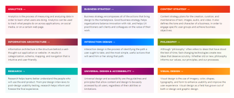
Below the main image and post list, we have an interesting example of creating similarity through size and shape in spite of colour. Each of the boxes has a different colour heading, but because they are all the same size, and share a common heading style (a darker colour, with a bold white word and a right-facing arrow), we perceive them to be similar.
Boxes and Arrows
This is an extremely simple site, but incredibly effective.
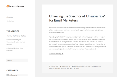
This site is a pleasure to use because it’s so quick to scan. The title of each blog post is by far the largest element and can be read while scrolling quickly down the page. The links in the body are underlined and stand out. And the “Continue reading” link is clear and consistent. Each post is set up with exactly this format. They’re all similar.
Links
One thing to notice is that they use two styles for links: body links are underlined, and the left-hand side menu links are not. The body links are easy to see when scanning posts due to the underline. The important thing is that links in the various sections (body links, or menu links) are styled the same way.
UX Pin
There are two things I want to highlight on UX Pin: the line of logos, and the blue CTAs.
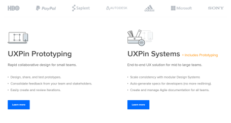
UX Pin has included a line of logos under their hero image (not shown here). Even though the logos do not have a header, the context of being on a site that offers a product implies that these companies use UX Pin. The logos have all been converted to greyscale, so no one logo stands out above the others. This is a good example of subtle similarity.
UX Pin has three CTAs on their landing page: one in the hero (pictured above), and the two Learn More buttons. Each of these buttons is styled the same way: blue, rounded corners, white text. All CTAs on the site follow this style. It doesn’t matter where the user is on the site, blue rounded-corner buttons are the CTAs.
Mockplus
Mockplus uses a fairly common site layout: alternating sections with a large picture on one side, and text on the other.
Site layout
Just like other examples, similarity is created through the use of size (both image and font), and layout. A little further down the page, they also use shape to create similarity between elements.
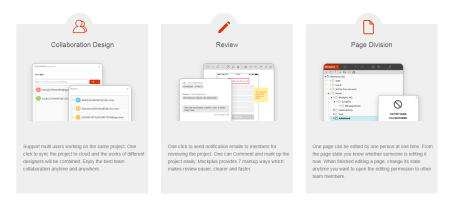
The boxes with semi-circles protruding from the top are clearly related. This simple addition to an otherwise rectangular box makes it clear that these boxes contain similar information.
TL;DR
The similarity principle states that things that look the same will be perceived as similar. You can create the perception of similarity among design elements by using techniques like colour, size, and shape. Being consistent across elements that you want to be perceived as similar is key.
To cement this idea, you need to practice. Take five minutes and visit your favourite sites and look at how they use colour, shape, and size to create similarity between design elements. Good luck, and design on.