Be A Better Designer With Gestalt Principles, Part 1 - Figure / Ground
Understanding Gestalt principles will help you be a better UX designer. This is the first post in a three part series that explains the Gestalt principles by showing clear examples of the principles from around the web. There’s no definitive list of Gestalt principles, but this series covers the ones that I use and think about the most when I’m creating prototypes. This post covers the Figure/Ground Gestalt Principle Figure/Ground Gestalt Principle.
Learning the Gestalt Principles takes the guesswork out of design.
When I started as a designer (my background was in usability), I had a good eye for knowing when something looks good, or when something looks bad, but had a hard time identifying exactly why. I was the typical client that didn’t know what they liked until they saw it! Then I learned about the Gestalt principles and it changed the way I thought about design and gave me a framework for being able to identify the why, and substantially improved my design skills.
There is value in doing competitive reviews to get ideas on the design paradigms and patterns used in a given product space, but this has limitations. Giving yourself a framework to think about design will make it easier for you to understand the why, and allow you to more easily and confidently create your own designs. The Gestalt principles give you this framework.
Principle: Figure Ground Relationships
This principle could be called the principle of “What matters and what doesn’t,” or alternatively, “The Foreground-Background Principle.”
When people look at a scene, the first thing that happens instinctively is they determine what in their field of view is important to deal with right now (a figure), and what is not (a ground). To do this, the brain perceives objects as either foreground elements (things to focus on because they need our attention) or background elements (things that provide context, but are not as important). Let’s look at some examples to understand some visual cues you can use to distinguish figure from ground. Delicious, beery, examples. I have to tell you that these wouldn’t be my personal beer choices, but I’m using them as examples because they’re all extremely popular and have clearly spent some money on their websites.
Creating contrast
Hero images, often with a clear call to action (CTA) button, are currently one of the most common patterns for landing page design. A good hero image uses the foreground/background principle to convey a message quickly, and make the next action obvious.
Moosehead uses a hero image with a clear foreground and background, conveyed using size, colour, and level of detail:
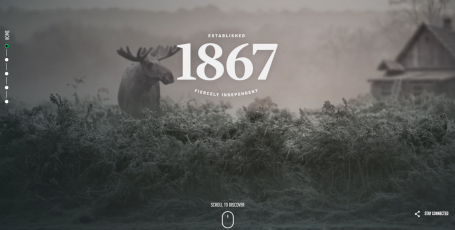
The text (the figure) is white with a thin grey border and is very large, both of which make it pop in front of the image (the ground). The contrast of the white text on the darker background also draws the eye. The background image is greyscale and has been blurred wherever there is text to ensure that the text is clearly the focus. Another way of thinking about this is that the background image has a lower level of detail (it’s blurry) than the foreground. All of these things work together to make it clear that the text is the figure and the image is the ground.
Heineken uses a movie as the background of their hero banner:

Using video background makes it a little more challenging to ensure that the message and CTA pop, but they’ve done an excellent job by using large white text and darkening the movie. The CTA, “Watch the prep talk”, is mounted on a semi-transparent black background that serves two purposes: to ensure contrast between the text and the movie so you can always read it, and to convey that it’s a button (it also changes on hover to make it crystal clear).
Boxes of content
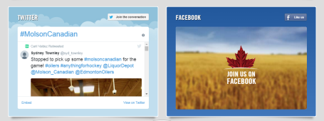
Molson Canadian uses boxes judiciously to separate foreground from background. This is what you see when you arrive at Molson’s homepage:

Three elements immediately jump out: the picture of the beer, the box on the top-right (“Click here to nominate..”) and the big white box (“Great Canadians deserve..”). The box on the top right is obviously a foreground element: the use of the white border clearly separates it from the image it’s on top of. Notice how the background under the image is primarily blue and dark yellow, providing contrast with the border, making it pop.
The images of the beer have sharp lines that contrast with the slightly blurred background (noticing a level-of-detail pattern here?) that create a distinct foreground feel. The boxes and images also overlap the background image: they are clearly in front of the background image.
Shadows
The bottom box on the Molson landing page above uses one more technique to separate it from the background: a shadow. Notice under the box there is a slight drop shadow. This provides the feeling that the box is on top of the wheat field. They use shadows again further down the landing page to provide the same effect:
Budweiser does the same thing:
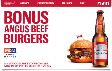
Notice the shadows under the navigation bar and the primary content? Both of these serve to give the illusion that they are “on top” of the background.
TL;DR
The Figure/Ground prinicple is all about using visual cues to indicate what is important (foreground/figure) and what is not important (background/ground). Three common techniques to do this are:
- using contrast (colour, size, level of detail), often seen in hero banners
- using boxes to separate content (overlap)
- using shadows to provide depth
To cement this idea, you need to practice. Take five minutes right now and visit your favourite sites and examine the techniques they use to convey foreground/background. Good luck, and design on.