Form Design UX Part III - Decreasing Perceived Cost
In part I and part II of this form design series, I proposed a method of thinking about form design in terms of a user’s cost-benefit analysis, and discussed ways of increasing the perceived value of the form. In this post I’ll discuss the research and methods behind reducing the user’s perceived cost of filling in a form.
“How much will it cost me?”
The cost of filling in a form isn’t usually financial. It relates to the perceived time, effort, and information required to fill in a form. If you’ve done your best to make the value of filling in the form clear, you’re on your way to higher conversions (i.e. percentage of people that complete the form). However, that’s only half the equation. The second question a user asks when deciding to fill in a form is “How much will this cost me?”
Types of Perceived Costs
There are three types of costs that a user incurs when deciding whether or not fill out a form:
- Time
- Effort
- Information (privacy)
Time is related to form length.
- Single vs. multi-page forms
- Number of form fields
Effort is related to field types.
- Field types: text input, textareas, dropdowns, etc.
- Effort also relates to how easy it is to fill in the form (e.g. error messaging, tab-order auto-forwarding, etc., but this is not covered here).
Information is related to a person’s privacy values:
- Types of information requested
- Name, email, phone number, address, etc.
Perceived Cost: Time
It’s commonly stated that shorter forms are better and you should use short forms if you want more conversions. This may or may not be true (as we’ll see later), but it ignores the most important question in determining form length: are you trying to get as many leads as possible (quantity), or fewer leads that are higher quality?
Determine The Business Goals
In most cases, forms are used to generate leads. Determining if lead quantity or lead quality is more important is the most influential factor when designing form length. In general, if you want a higher quantity of leads, use a shorter form. If you want higher quality leads, use a longer form.
The business motivation varies from situation to situation, and from company to company. For example, a startup without many leads may want to generate as many leads as they can because they’re doing all they can to create contacts, build their brand, etc. A well-established company with a broad and deep network likely does not have the same motivation. They still want to generate leads, but the quality of those leads is more important.
Reduce The Perceived Form Length
Intuitively, if a form looks too long, users are less likely to engage with the form. While I haven’t been able to find any concrete data on the optimal number of fields to display on a single page form, one recommendation is to display no more than 5-7 fields on a page before considering breaking a form up into multiple pages.
Use Multi-Page Forms
By breaking long single-page forms into multiple pages, you can often increase conversions. FormStack found that single-page forms have an average conversion rate of 4.53%, whereas multi-page forms have an average conversion rate of 13.85%. It’s possible that much of this effect is due to contact forms having a very low conversion rate and are often single-page forms.
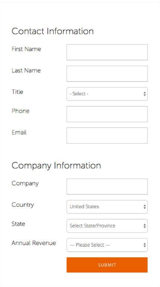
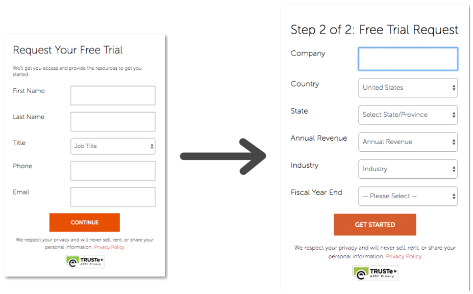
Adaptive Insights recently ran a test to determine if a single or multi-page form would lead to increased conversions. The only change they made was to convert a one-page form into a two-page form, and they found that the multi-page form lead to a 30% increase in demo requests.
Here is their original, one-page form:
And here is their modified, multi-step form:
Smashing Magazine has an insightful article on why multi-step forms are beneficial, and gives a guideline into how to divide your content into multiple-steps.
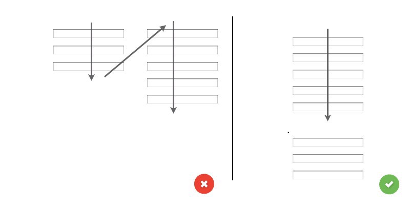
Use A Single Column Layout
You may be tempted to use a multi-column for instead of a single column form to reduce how long the form looks, however, that’s probably not a good idea. ConversionXL ran a study to determine the effect of single vs. multi-column layouts and found that users filled out forms with single-column layouts significantly faster than multi-column layouts (99% confidence).
There does appear to be one exception to this rule: when designing a form that requires a long list of options, one study found that using double-banked lists (splitting the list in half and putting them side-by-side) was preferable to users than having to scroll to see options in a single list. They found that users read the list faster, and most participants indicated they prefered the double-banked lists.
Reduce the Actual Form Length
Another way to reduce the perceived length of a form is to actually shorten the form: you can often reduce the number of form fields without reducing the data collected. Of course, one of the most widely discussed questions in form design revolves around the number of form fields: does the number of form fields matter?
Form Length: Does The Number of Form Fields Matter?
If “Shorter is Better”, Where’s The Proof?
When I started investigating whether or not form length affects conversions, I kept finding references to two studies in particular: one about how Expedia increased their revenue by $12-million / year by removing one form field, and another about how Imaginary Landscape increased contact form conversions by reducing the number of fields from 11 to 4. Looking into these, I found that they were misrepresented as proof to show that shorter forms are better. In the Expedia case, the $12M issue wasn’t that there was one extra form field, it was that the particular form field was asking for information that was confusing the users and stopping them from being able to check out. In Imaginary Landscape case, there were many confounding variables (they used different types of fields) and the data was misrepresented: they claim a 160% increase in conversions (10 responses increased to 16 responses), but they didn’t take into account the number of visitors in the timeframe! So there was an increase, but it wasn’t as big as 160% sounds. I decided the matter of form length warranted further investigation.
Studies On Form Length
I looked at four studies that examined the effect of form length on conversions. Form length in this case is defined in terms of number of total number of fields, not visual length. What I found is that in general, shorter forms lead to higher conversions, but the importance of form length appears to be highly contextual: the higher the perceived benefit of filling in the form, the more fields users are willing to fill in. The second best advice I have here is to really consider the information that you’re asking for, and if it’s not necessary, eliminate it. The best advice I have here is to test the effects of adding and removing fields on your forms!
Hubspot
Hubspot analyzed over 40,000 landing pages from their customers and found that forms with 3 fields had the highest conversion rates.
Unfortunately, this data isn’t broken into form types, or field types. Imagine that you had a contact form with 10 complicated fields; your conversion rate would be close to 0%! Alternatively, imagine you had a 100 question contest with very complicated question types, but you were offering a new house to the winner. I’m guessing you’d have almost a 100% conversion rate. Still, they found that in general 3 form fields is the sweet spot, and more or less fields reduces the conversion rate.
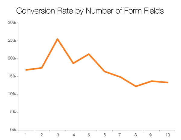
FormStack
FormStack’s 2015 Form Conversion Report breaks the forms into form types and clearly shows that the number of fields in a form is not the primary factor involved in conversion rate.
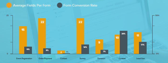
It appears that the motivation for filling in the form is much more important than how long your form is. Unfortunately, the lack of data granularity doesn’t allow us to assess the importance of form length within a particular type of form.
Unbounce
In another study, Oli Gardner, co-founder of Unbounce, pulled data from the Unbounce landing page database and found an interesting trend with respect to form length.
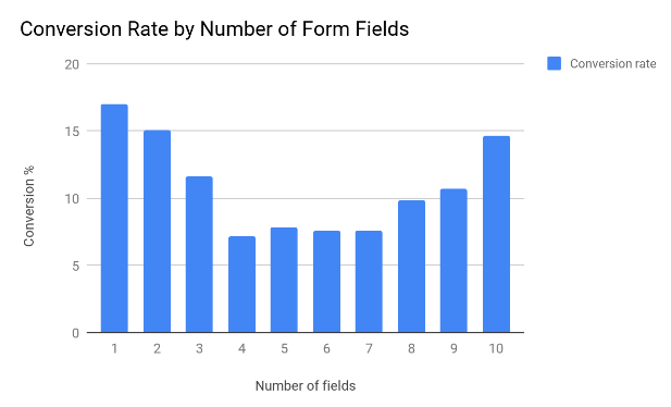
We don’t know how many forms this is based on, the form types, or the field types, but this is still very interesting:
- Having 1 or 2 form fields performed very well relative to having three fields. One possible explanation is that if a form asks for two fields, they are likely name and email. A third field on most contact forms for example, requires much more effort: a textarea that asks the user to enter their message. This is purely speculation, but a plausible explanation.
- Between 4 and 7 fields, there was little difference in conversions. This is worth testing on your forms! If there’s little difference between asking for 4 pieces of data and 7, and the extra data is valuable, consider adding in and testing extra fields.
- Conversions increased after 7 fields. This might be that the longer forms offered more value to customers. We saw in the FormStack data that the number of form fields has almost no correlation with conversion percentage.
Oracle
In 2011, Oracle analyzed data from 1,500 forms over a three month period. The forms they analyzed were on landing pages, meaning that users had already expressed an interest in the product or service being offered.
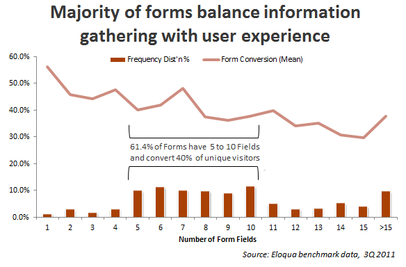
We can see a fairly steady downtrend in the data, showing that the more fields a form has, the lower the conversion rate. We cannot draw many conclusions from this data, but we can see that much like the FormStack, there seems to be a point at which adding form fields does not appear to be too harmful (4-7 and 8-13 fields appear to be fairly similar in terms of conversions).
Oracle did note the effects of form type on conversions, much like FormStack. The found that:
- Forms offering trials don’t see a significant drop in conversions until 8 fields.
- Forms offering downloads don’t see a significant drop in conversions until 11 fields.
- Webinar event registration forms see a significant drop in conversions after 5 fields.
They didn’t make this data available, so we can’t do any further analysis.
Perceived Cost: Effort
Another type of cost involved with filling in a form is the perceived effort required to do so. This can be divided into two sections: deciding to fill in the form, and actually filling in the form. When a user looks at the form and gets a first impression, they see the length (perceived time) and the types of form fields (perceived effort to complete each). This post doesn’t cover the effort related to actually filling in the form, such as where to place labels for maximum readability, where to put error messages, etc.
Form Field Types Matter
Intuitively, different kinds of form fields require different levels of effort to fill in. Entering your name in a single-line text box takes almost no mental effort, it’s just a matter of typing in the information (which is a different kind of effort). Entering data into a textarea on the other hand requires more mental effort: the user has to write a statement or question about a problem.
Text Inputs
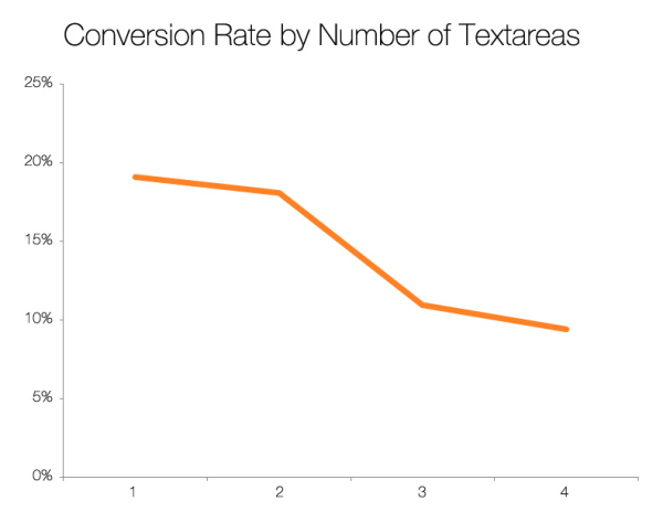
Hubspot found that there was very little change in conversion as the number of single line text inputs increased.
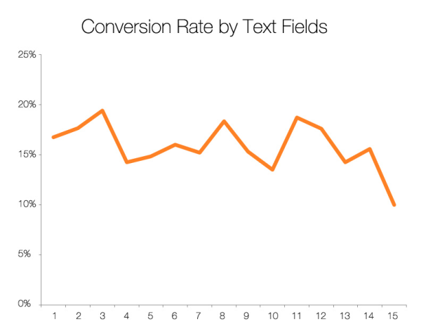
However, they found that having more than two textareas (multi-line text inputs) lead to a large decrease in conversions.
Radio Buttons, Dropdowns, and Image Selection
There are a number of inputs available to allow selecting an option from a list: radio buttons, dropdowns, and image selections. Econsultancy found that changing from a dropdown box to an image box selection increased form conversions by 212%.

Leadformly, a company specializing in lead-generation forms, claims that selectable images are some of the most engaging question types based on “seeing countless form design A/B tests, and studying the work of companies that have invested heavily into form optimisation.”
FormStack recommends reducing the use of radio buttons because their research shows that they are a leading cause of high abandonment rates.
Perceived Cost: Information
Not all information is valued equally. Go through your form, field by field, and ask yourself “Do I really need this information at this point in time, or can I get it later?” If you don’t need it to move forward with this lead, consider removing it. As we’ll see below, asking for certain types of information can hurt your conversion rates.
Phone Numbers
Hubspot, when analyzing 40,000 forms, found that referring to phone number lowered conversion from 19% to 13.5% on average. They also found that referring to the word “call” lowered conversions from 17% to 12.5%.
Individual case studies have also been done on asking for a phone number. ClickTale found that 39% of potential customers were abandoning their form on the second step, and almost all of them abandoned when asked for their phone number. The phone number wasn’t marked as required with an asterisk, but users still abandoned the form. When they added the word “optional”, conversion rates improved from 43% to 80%, and decreased the fallout to 4% on the second step.
Marketing Experts found that moving the phone number field from the first step of a form to the second step increased lead generations by 68%, and that their conversion rate remained the same.
Address Fields
Hubspot also found that asking for address fields reduced form conversion rates. Asking for city or state reduced conversions from approximately 16% to 15% on average, while asking for street reduced conversions from approximately 16% to 12.5%.
Age
Hubspot also found that asking for age lowered conversions on average from 18% to 15%.
Summary
Form design is hard. It’s also extremely important, as a lot of your leads will come from your forms.
After pouring over data and case studies, I have reached the following conclusions:
- What you offer for filling in the form is arguably the most important factor in form design.
- Increase the perceived value of your form by clearly conveying your value proposition in the form headline and be specific in your button copy.
- Decrease the perceived cost of your form in terms of time, effort, and information by choosing the type and number of your form fields carefully, and not overwhelming your users.
- Most importantly, there is no silver bullet for form design. Your best bet is to put your best guess forward, come up with some alternatives, and A/B test them.
There is much more to form design than I’ve covered in this three part series. Considerations like where to place your form, the kinds of graphics used, additional information included in or around your form (such as social proof, security certificates, etc.), label positioning, error reporting, etc. aren’t discussed at all in this series.
My goal was to look at and present existing data on form studies, and propose a way to think about form design. I hope you’ve found this series helpful, and that it leads you to higher conversion rates.
Form Design UX Series
Part I: User Motivation Part II: Increasing Perceived Benefits Part III: Reducing Perceived Costs