Form Design UX Part II - Increasing Perceived Value
In the first part of this Form Design series, I outlined a framework for thinking about form design in terms of a cost-benefit analysis: users’ motivation to complete forms based on the perceived benefit and the perceived costs. This post covers how to increase the perceived value of forms by writing better form headlines and button copy. This post provides an overview of existing research and case studies, and recommendations on how to improve the perceived value of forms you design.
Perceived Value
You have very little time to convince a user who is deciding if it’s worth filling in a form. You have to make the form’s value proposition obvious. This starts with having a good headline with a compelling value proposition.
Put yourself in the shoes of your users. Look at your form for 5 seconds. Now close your eyes and ask yourself:
- “What will I get by filling in the form?”
Chances are, you answered the question based on what you saw in the headline, and in the button copy.
Increasing Perceived Value: Writing Better Form Headlines
As a person designing a form, it’s easy to say “there’s lots of value in this” because you already know how great the product or service is that you’re offering. But your potential clients don’t know your value, and it’s your job to convince them.
After reading your form’s headline (and sub-headline if one exists), it should be obvious to a user why they should fill in the form. For example, here’s a brief list of things your form might do and questions that your headline should answer.
If your form:
- is asking a user to make contact → “Why should I make contact?”
- is offering a free demo or trial → “What does the product do?”
- is offering a free e-book or some other downloadable → “What will I get?”
A good headline makes the form’s value proposition obvious.
If you can’t answer your these questions based on reading the headline, try out a different headline and test it. With forms, there is no surefire right answer for anything because they’re so context-dependent. A/B testing different versions of your forms is the best way to determine what works best for you.
How To Write A Good Form Headline
Your form headline should:
- Tell the user the value of filling in the form from the user’s perspective.
- Be specific about what they will get by filling in the form.
- Answer the user’s question: “Why should I bother?”
Creating headlines that get all of this across is hard work, and more of an art than a science. It takes practice and, most importantly, testing, testing, testing!
Tell The User What They Get, Not What The Business Wants
A fairly common mistake is to simply state the business goal in the headline. “Sign Up For Our Newsletter”, “Join CompanyName”, “Choose A Plan”, etc. Unless the user is already convinced to do so, these headlines do nothing to persuade a potential customer to take action. Re-writing these headlines to clearly explain the value to the user provides an oft-needed nudge that gets them to fill in the form.
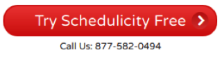
Unbounce provides an example of the effect changing headline copy can have on conversions. They increased sign-ups by 31.54% on a betting forum by improving the headline and button copy.
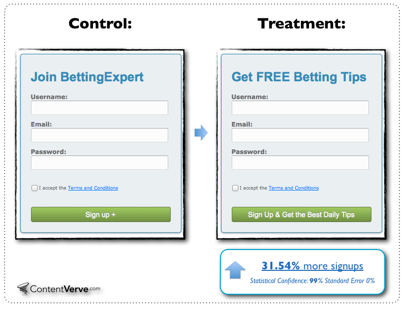
By including the value proposition from the user’s perspective in the headline and being specific in the button copy, they increased signups by 31.64% with 99% confidence. Unfortunately the test changed two variables (both the headline and the button copy) and it’s impossible to say how much effect each had. What is certain is that by making these two changes, the sign-ups increased.
Writing good form headlines is difficult. Thankfully, there is one strategy that can be very helpful…
Flip Your Headline And Sub-Headline
One strategy outlined by Oli Gardner, co-founder of Unbounce, is to flip your heading and sub-heading copy. Often the sub-heading contains more information about your value proposition than your headline. Instead of hiding this value proposition in the sub-heading, make it the heading and make the value obvious.
A great example of this strategy can be found in a test by Highrise. They decided to test five different headline combinations to see if the headline and sub-headline copy had an effect on plan sign-ups. They tried five different headline/sub-headline combinations, and found that over 4000 page views, they got a 30% increase in sign-ups by only changing the headline and sub-headline copy. Here’s the original:
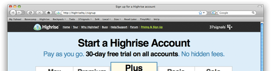
“Start a Highrise Account” is the value proposition for the business, but not for the user. The business wants you to start an account, the user has no idea why they should bother - they’re not given any reason to sign-up in the headline. Here’s the winner that lead to a 30% increase:
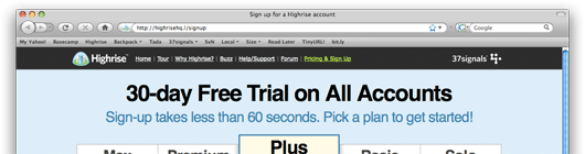
In the original they had the value proposition in the sub-headline: 30-day free trial on all accounts. In the winner, that value proposition became the headline and they included a message about how easy signing up is.
Increasing Perceived Value: Writing Better Button Copy
On single page forms, another key piece of information that a user has “at a glance” that they can use to assess value is the button copy.
Button copy should be specific, and convey the value and relevance of the button. It should answer these questions:
- “Why should I click this button?”
- “What will happen when I click this button?”
A number of A/B tests have been done to assess the effects of changing button copy on conversion rates on landing pages. Though very few of these tests have been specifically about forms, they show the powerful effect of writing good button copy, which applies to form button copy.
Button Copy Case Studies
I did a survey of case studies that tracked changes in conversion % after changing button copy. Although I tried to pick studies that only changed the button copy, in some cases, other minor changes were made also. I did not include studies that I thought the other changes significantly affected the results. All images were captured from the linked articles.
| Old button | New button | Conversion % Change | Confidence | My Reasoning |
|---|---|---|---|---|
 |
 |
10.94% | 99% | More specific & more value. |
 |
 |
90% | 98% | More personal. |
 |
 |
38.26% | 98% | Less effort (order vs. get). |
 |
 |
(39.03%) | 99% | Less specific. |
 |
 |
68% | 99% | More specific. |
 |
 |
31.03% | n/a | More specific. |
|
 |
(24.91%) | 99% | Less personal. |
 |
 |
24% | 98% | More personal and more value. |
 |
 |
33.1% | 96% | More specific and more value. |
 |
 |
60% | n/a | Less effort (book vs. get). |
 |
 |
49.85% | n/a | More value. |
 |
 |
14.41% | 99.9% | More specific. |
 |
 |
74% | n/a | More specific. |
 |
 |
192% | n/a | More specific. |
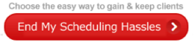
Take-aways from these case studies
- Buttons that were more specific had higher conversions. Being specific about what would happen when the button was pressed improved results in all cases.
- Buttons that implied effort had fewer conversions than buttons that implied less effort. Using “Get” instead of “Order” and “Book” improved results.
- Buttons that were more personal had higher conversions. Using “my” instead of “your” improved conversions, while using “your” instead of “my” worsened conversions.
- Buttons that conveyed the value proposition had more conversions. Stating how clicking the button would help the user resulted in more people clicking the button.
Large Scale Form-specific Studies
I found two studies that analyzed a large number of customer forms. One was performed by Hubspot, and the other by Formstack.
Hubspot
Hubspot’s Dan Zarella looked at over 40,000 forms, paying careful attention to button copy. He specifically examined how using the word “Submit” in button copy affected conversion rates.
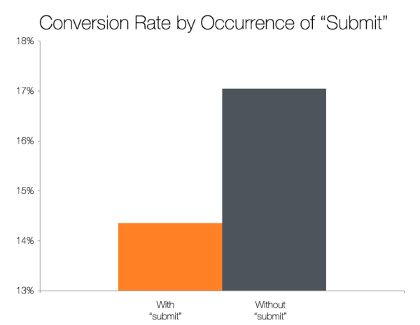
He found that forms on landing pages with buttons labelled “Submit” had a 14.5% conversion rate on average, and forms with other wording had a 17% conversion rate. This could be due to any number of factors (form placement, button layout, form design, etc.), but over 40,000 forms, it’s a good indication that there’s likely a better choice for your button copy that “Submit”.
Formstack
In Formstack’s 2015 Form Conversion Report they analyzed over 650,000 forms and conclude that you should:
- Keep your button copy short (the top-ten converting buttons all contained two words or less).
- Use words that inspire action.
- Be specific (adding a single word after “submit” can boost conversion by up to 320%).
However, this data should be carefully considered before taking it as gospel. They looked at a lot of different types of forms, and each form performs very differently. Contact forms were by far the most represented type of form in their study (see below), and had by far the lowest conversion %. That means that common button copy used on contact forms (for example, “Submit”) would have a much lower conversion percentage due to the fact that contact forms have such a low conversion percentage. The data would be much more valuable if it were reported by form type.
| Type of form | Conversion rate | Avg. # of fields | # forms analyzed |
|---|---|---|---|
| Event Registration | 11% | 15 | 6,198 |
| Order/Payment | 9% | 22 | 16,182 |
| Contact | 1% | 4 | 76,426 |
| Survey | 14% | 22 | 6,943 |
| Donation | 7% | 9 | 6,634 |
| Contest | 35% | 10 | 2,318 |
The data in this table was gathered from the 2015 Form Conversion Report.
The Submit Conundrum
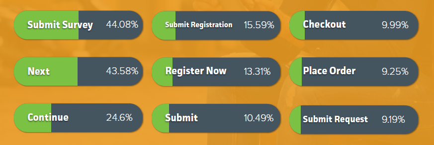
We’ve got a contradiction! On one hand you’ve got Hubspot saying forms using “Submit” perform worse than forms without it, and on the other, you’ve got Formstack saying “Submit” is used in 4 of the top 9 converting buttons.
The Formstack survey results are not very useful in this case. They tell us that “Submit Survey” has a higher conversion % than “Submit Registration”, “Submit”, and “Submit Request”, but it’s across all form types. Contests and surveys have the highest conversion rates but account for only a small percentage of all forms, so naturally “Submit Survey” has a high conversion %. We can’t determine how well “Submit Survey” performs relative to other options on survey forms, so we’re missing key data to make sense of the results. Also, “Submit” is likely used on contact forms a lot (which have only a 1% conversion rate) whereas “Submit Survey” is likely never used on contact forms. So “Submit” will be weighed down by the volume and low conversion % of contact forms, while “Submit Survey” will not be.
TL;DR You probably shouldn’t use “submit” as your button copy. It is not very specific, and doesn’t convey much value. Being more specific, e.g., “Submit survey”, is likely better, however, there may be better options without using “submit” at all. A/B testing multiple options is the best way to go.
How To Write Good Button Copy
One popular method is to write button copy by finishing the sentence:
I want to __________.
Using this technique forces you to do three things:
- Write in the first person.
- Address the user’s desire in the button copy.
- Be specific.
If we look at a few examples from the table, we can see this in action:
- I want to “Get Started Now” vs. I want to “Shop Medicare Plans”. Even though people might want to get started now, it’s not clear what they’ll be started. It’s very clear what will happen in the latter case.
- I want to “Download” vs. I want to “Get your FREE converter now”. Yes, people want to download, but with Download it’s not clear what they’ll be downloading. Get your FREE converter now says exactly what will happen when they click the button. I’d love to see another test here that uses “my” instead of “your”.
- I want to “Start your 30 day trial” vs. I want to “Start my 30 day trial”. This is probably the most clear example of writing in the first person, and shows why finishing the “I want to __.” sentence is a good template.
This is a great way to generate ideas for your button copy. After coming up with two or three options, you should test, test, test! Forms in different contexts will have different results, so to find out what works best for your form in your context, you have to test.
Summary
To maximize the chances of people filling in your forms, you need to provide them with motivation to do so. Two ways you can do this are by writing good form headlines and writing specific, compelling button copy.