TripSeer
“ThinkUX provided strong UX expertise and the passion to apply it to our design problems. Communication was fast, open, and precise, and their work went above the deliverables in meaningful ways.”
The Challenge
TripSeer is a web application offering intelligent trip planning and itinerary management. It allows users to create trips with multiple destinations, and manage accommodations, activities, and travel methods between their destinations. The client approached us because they were concerned that while the application was rich with features, it was "too complex and difficult for users to learn".
Understanding the Problem
Expert Evaluation & Competitive Analysis
To get a sense of the strengths and weaknesses of the TripSeer interface, we performed an expert evaluation with two evaluators. It had a lot of powerful functionality, but the interface was overwhelming,and there was no obvious starting point. We created a Google Slides deck and presented our findings. We also identified and reviewed some competitor products. This provided insight into industry standards and gave us an idea of where TripSeer stood in terms of features and usability.
Stakeholder Interviews
Next, we interviewed the stakeholders to get an understanding of their business goals and their vision for the project. We discussed the user research that TripSeer had already completed, including a questionnaire and some user interviews. During this meeting the CEO also gave us a demonstration of the system, which revealed some additional functionality that we hadn’t discovered during our expert evaluation.
User Interviews
To understand how people plan trips, we interviewed users who had planned trips with multiple destinations in the past. We asked them to walk us through trips they’d planned, including their overall planning process, the importance of various factors like cost and scheduling, what resources they’d used, and so on. This helped us understand various ways that people plan trips, and what potential users look for in a trip planning application.
Personas & User Stories
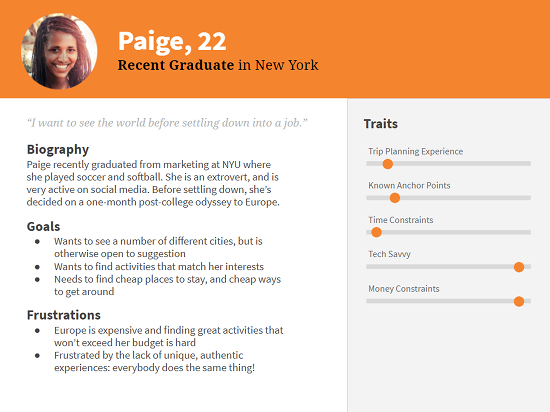
Based on the questionnaires that TripSeer had collected, and information we uncovered in our user interviews, we worked with the stakeholders to create six user proto-personas, with accompanying user stories. These personas helped us to solidify a mutual understanding of the various user groups, and what TripSeer should do for them.

Design and Prototype
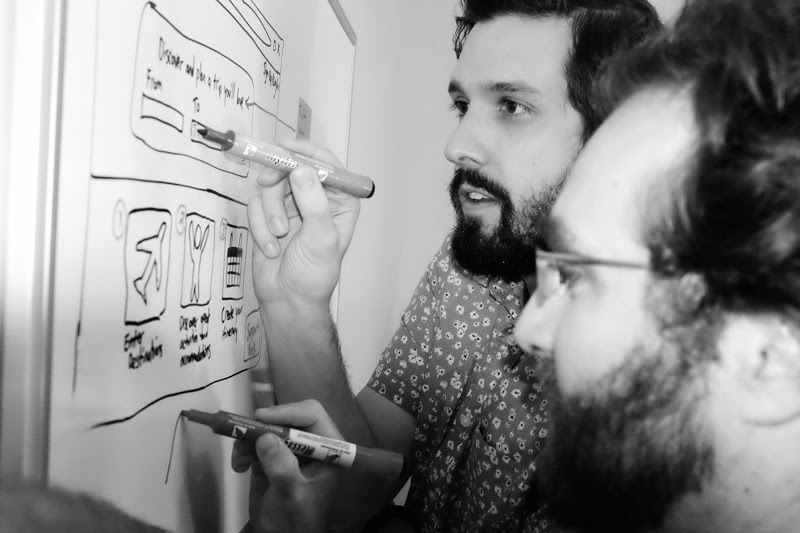
We focused on the landing page and the trip planning flow, with the goal of making TripSeer more intuitive and less overwhelming for users. Using the personas, we brainstormed to determine which features were essential, and how we could design an interface that would accommodate the non-linear workflow of planning trips.
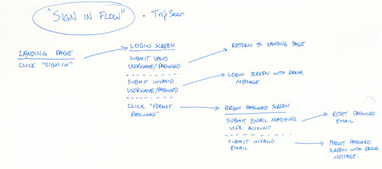
We sketched some ideas for the interface and mapped out user flows between the screens, then demoed to each other how the different user personas might approach it. Eventually we narrowed it down to something that we thought would work.

One of the most challenging problems was how to manage and change the number of days being spent in each destination on a multiple-destination trip. This is a difficult problem because different users have different needs: some users want to travel on specific dates with a strict itinerary, others are more flexible and want to get the best value for their money, and others want to fill in the dates at the end after they’ve planned their trips around cities and activities. We also had to consider what would happen when new destinations were added, or existing destinations were removed. We spent a lot of time workshopping these controls and came to a solution that we believe accommodates all of these needs.

Ultimately, we created some wireframes and an interactive prototype, ready for testing with users.
User Testing & Iteration
We created a testing protocol with some key tasks, based on the user stories that we’d identified. Then we recruited four users who had experience planning trips, and tested the interface with them.
Most of the tasks were completed without too much difficulty by each of the users. Our solution for managing arrival and departure dates across the different destinations seemed to work well, and the overall feedback was quite positive. The tests also revealed some usability issues, and some tweaks that we had to make, so we adjusted the prototype before delivering it to the client.
The Result
At the conclusion of the project, we'd provided TripSeer with:
- A simplified landing page
- A simplified workflow for entering destinations and dates
- A simplified view for itinerary planning
- Proto-personas and user stories to further refine with future user research
- Design changes validated through user testing
- Feature suggestions such as integration with TripAdvisor recommendations, based on findings from user interviews
