Singularity University
“ThinkUX is unbelievable at what they do. Amazing, useful, and tangible recommends we can put into practice right now to achieve our desired goals. We'll definitely be working with these guys in the future.”
The Challenge
Singularity University (SU) is a think tank co-founded by Ray Kurzweil that focuses on applying exponential technologies to problems like food scarcity, sustainable energy, and prosperity. They launched an online learning portal to complement their offline seminars and conferences, and wanted us to help them increase signups, improve the design of their course pages, and simplify site navigation.
Understanding the Problem
Stakeholder Interviews
We interviewed the director of the project and the head instructor. We discussed their project goals, their users, how the pilot for the courses had gone, and the research that they’d already completed. They had done a great job of collecting data through Google Analytics and customer surveys, which provided us with a lot of useful insight.
Users & Audience
Singularity University’s online offerings were primarily targeted at people who applied to SU events in person, but hadn’t yet been able to attend.
Their secondary users included:
- Entrepreneurs who view SU as having the “keys to the future”, want to connect with like-minded people, and who want to get ahead of the curve
- Corporate leaders who want to ensure their market position by preparing for the future
- Social impact leaders who see an opportunity to use exponential technology to do good in the world
Constraints
Time was the biggest constraint: SU was aiming for a new cohort of students to begin the introductory course just a few weeks from the start of the project. Following that course, the longer-term course series was going to start.
Comparative Analysis & Expert Evaluation
We completed a comparative analysis of other online learning platforms such as Skillshare, Coursera, General Assembly, and Udemy. This gave us an idea of where similar products stood in terms of features and usability. We then completed an expert evaluation of Singularity University’s online learning portal, with a focus on areas where we could improve user signups and engagement with the courses.
Design
We focused on the landing page, the sign up flow, and the course information pages.
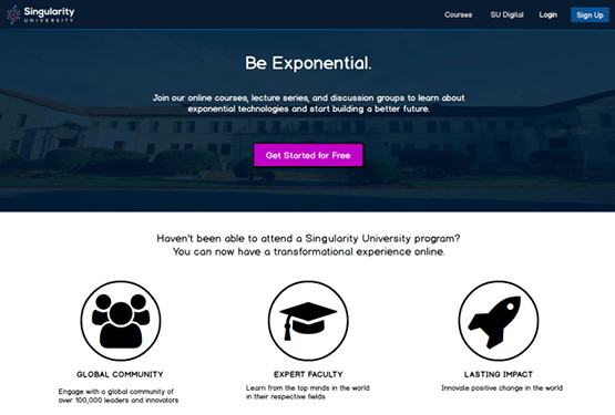
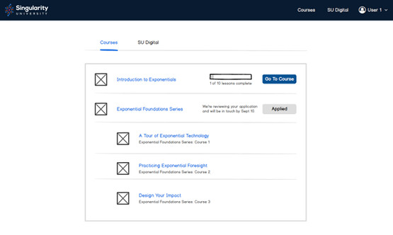
On the landing page we aimed to more clearly communicate the purpose of the site, the benefit of the SU courses, and provide a more clear call to action (CTA). We also created separate landing pages for guests and registered users. Registered users had reported having problems finding their courses after returning to SU, so we simplified the process by adding their courses and course progress to the landing page after signing in.


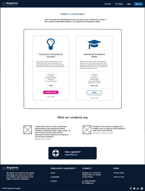
One of the SU business goals was to simplify the registration process for both the introductory course and the paid course series. We focused on creating a clear path from landing as a guest to joining the free course or applying for the course series. We also made recommendations on how to improve the site registration and course application forms to increase conversions.

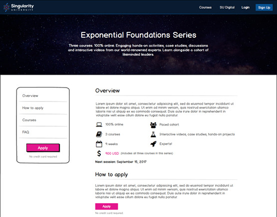
We redesigned the course information pages to quickly communicate the price, time commitment, course duration, and activity types (e.g. videos, readings, discussion groups). We also added social proof in the form of former student testimonials, and a FAQ to answer the most common questions about the courses.

Results
SU were extremely happy with the redesign, and immediately set to work on updating their site. The changes were completed before the next student cohort began the introductory course, and after implementing our recommendations and new design, they have seen an improvement in signups and user engagement.
