Child Development Research Unit
"[ThinkUX] enabled us to focus on our research because they consistently delivered high quality products. The results speak for themselves: we improved from close to 0% task completion to nearly 100%."
The Challenge
The Child Development Research Unit (CDRU) is a research laboratory at the University of Guelph that studies developmental issues related to child health. We were hired to help the CDRU researchers design and build a virtual reality (VR) training game to help teach children to cross the street more safely, in a number of realistic suburban environments.
Understanding the Problem
To help us understand the problem, we performed stakeholder interviews, then defined user groups and use cases.
Stakeholder Interviews
We interviewed the researchers, who were domain experts in pediatric psychology. We helped them refine the project goals, and to define research measures to be captured by the system. We worked with them throughout the project to ensure that the training game aligned with their research goals.
User Groups
The research subjects (participants), children ages 6-9, were the main users of the system. They needed to be able to look and walk around virtual environments using an Xbox controller. The system needed to be engaging in order to maintain the attention of the children so that they could complete the training comfortably, and in a reasonable amount of time.
The other primary users of the system were research assistants at the CDRU. They needed to be able to set up new participants quickly and easily, as they had only limited time with each child. They also needed to be able to recover from errors in the event of a technical failure, or if the participant needed to take a break, and resume from where they left off.
Building the MVP
We knew that the system needed to support the following:
- Multiple environments with different levels of visibility for oncoming traffic (e.g. a curve in the road, parked cars, etc.).
- The ability to detect when the participants engaged in dangerous behaviour (failing to look both ways, entering the street too close to an oncoming car, etc.), and provide immediate feedback on their actions.
- The ability to assess when participants had achieved competence with a training concept, and advance them to the next concept.
We sketched out each of the possible scenarios and environments, and created flow diagrams to illustrate how participants would flow between the training stages.
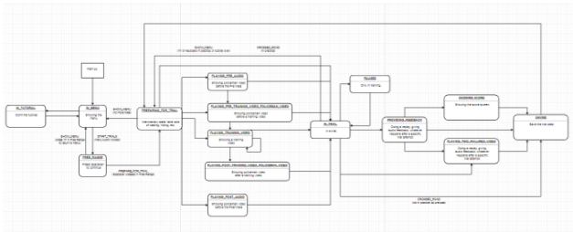
Given the complex nature of the immediate feedback and system flow, a working prototype was required to test participants. The original vision of the system was a desktop application, controlled with an Xbox controller, with three widescreen monitors to provide a wider field of view. We worked with the researchers to define which features were most essential, and built a minimum viable product (MVP) to test those features with users.
Our Process
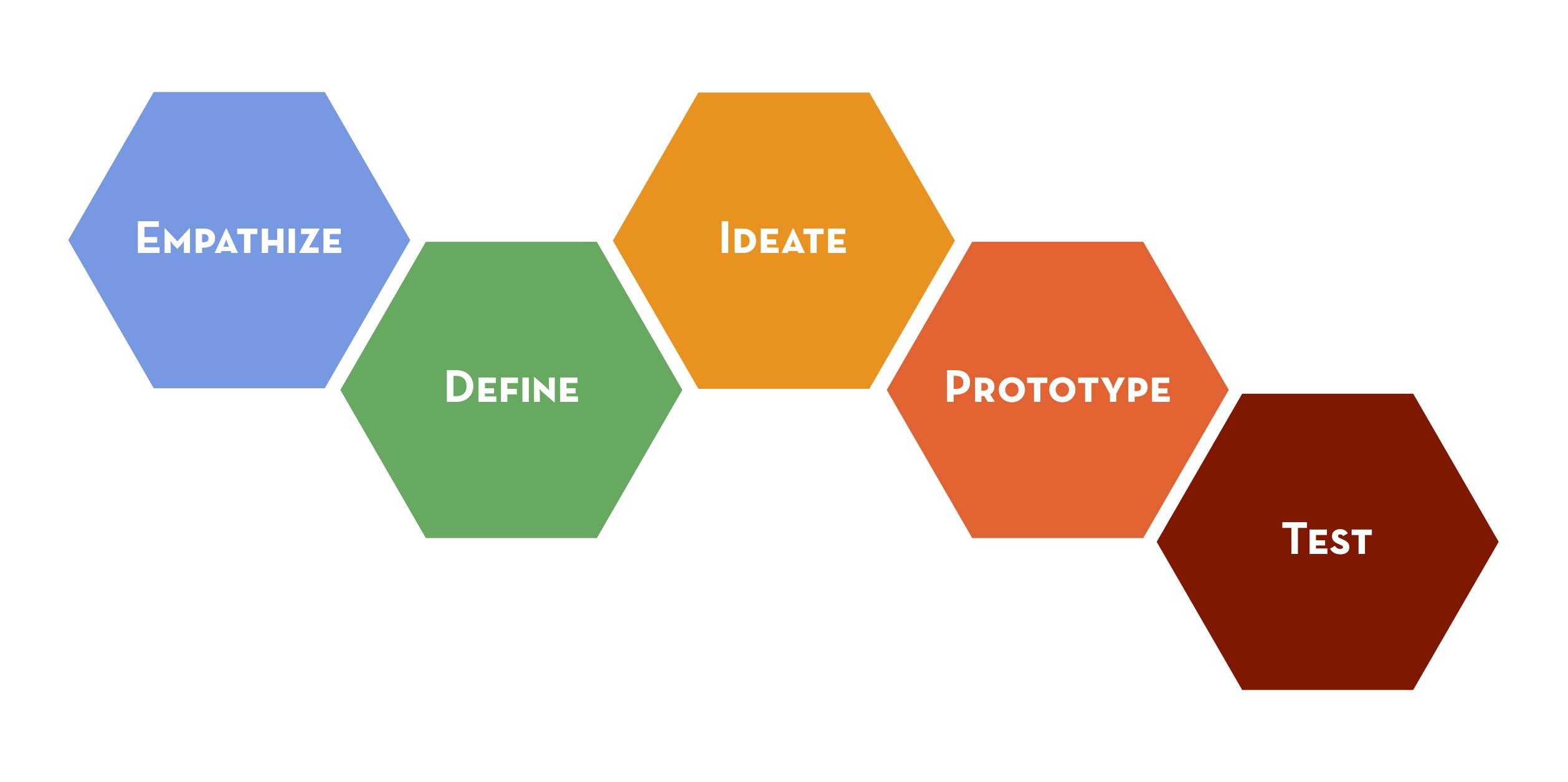
After we built the MVP, we started the process of testing with users and iterating the prototype. After each round of user testing (generally 3-5 children), we would identify the most common issues and brainstorm solutions for them. We’d present these to the researchers, and collaboratively decide on the best course of action. We would then integrate the solutions into the system, and perform more user testing.
Results
User testing helped us to identify a number of usability problems with the system. Some of the major problems and our solutions are summarized in the table below, along with the results that our solutions achieved.
| Problem | Our solution | Result |
|---|---|---|
| Participants found the training tasks too difficult and were often unable to complete them. | We broke the training stages down into smaller, more easily understood sections, allowing them to focus on one concept at a time. | Significant improvement in training completion rates. |
| Participants weren’t engaged with the system, and were losing interest before completing the training tasks. | We changed from using a 3-screen setup to using an Oculus Rift (VR headset) to increase immersion. We added animations, updated the scoring system, and streamlined the flow between training stages. | The amount of time it took to complete the training session was reduced, participants were far more engaged, and completion rates improved. |
| Participants had trouble navigating the virtual world using the controller. | We tested different control schemes until kids better understood how to navigate the world, and created an interactive tutorial to establish a baseline for control competence. | Reduced frustration in the participants. Significant reduction in the number of control-related errors made while using the system. |
| Participants didn’t understand some of the training instructions and would repeatedly make the same mistake. | We iteratively re-worked the problematic training scripts, testing with users until the comprehension rate increased. | Higher comprehension of training videos, fewer repeated mistakes. |
| Participants experienced motion sickness when using the Oculus Rift headset. | We changed the way the system displayed replays based on VR motion sickness research. | Almost no participants reported motion sickness. |
One problem area that our user testing revealed was user engagement. The users were in the age range of 6 to 9, and were frequently losing interest in the training, which meant that their performance wasn't improving much. We ended up making a number of tweaks to remedy this, including:
- Making the instructions shorter and straight to the point
- Adjusting the replay camera angles to make the feedback more clear
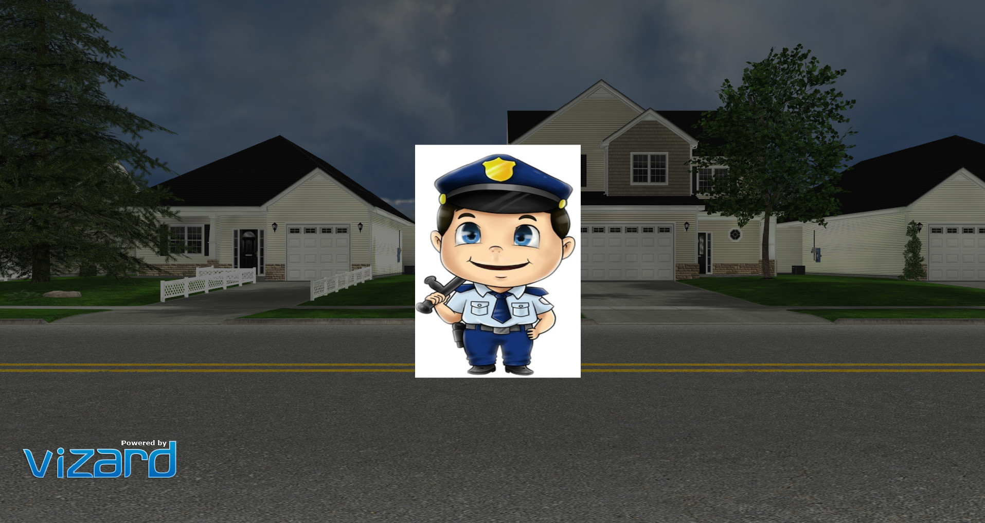
- Adding a policeman character to deliver any audio instructions
We also updated the scoring system to give more rewards for good performance, and make it easier for the participants to demonstrate mastery and move on to the next lesson. Overall, these changes had a marked impact on user engagement.
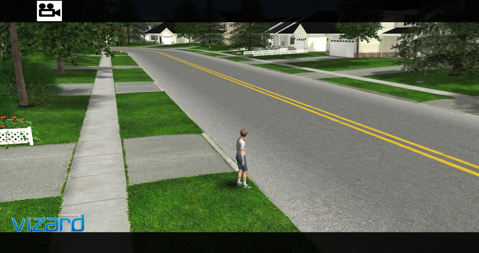
The CDRU is currently collecting data using the training system, and early results are promising. The project was featured on CityNews in Toronto (1:25 onwards in the video below shows some of the training system in action).
In the end, we created a system that has shown promise in improving child safety when crossing the street, using an engaging VR interface, and with lessons that are clear and understandable for the target users. We also learned a lot about pedestrian safety, and can't help but think about this project any time we prepare to step into the street!
