Form Design UX Part I - User Motivation
When asked to fill in a form, users ask themselves “Should I bother?” The assessment is often quick and brutal. They perform a quick cost-benefit analysis to assess whether the benefits of filling in the form outweigh the costs (and by how much). Then they fill it in, or move on. As a form designer you want to do everything you can to get them to say “ yes, I should bother!”
Forms: A Cost-Benefit Analysis
People generally don’t want to fill in forms. When a user is faced with a form, they ask themselves “Should I bother?” To answer the question, a user makes two assessments:
- What will filling in the form get me and how valuable is that thing to me? This is the perceived value.
- What will it cost me in terms of time, effort, and information? This is the perceived cost.

This is a cost-benefit analysis. If the perceived benefit outweighs the perceived cost, your form will likely be filled out. If the cost is higher than the benefit, it’s likely your form will be ignored or abandoned. As a form designer, your job is to increase the perceived value, and reduce the perceived cost.
Perceived Benefit (a.k.a. “What’s in it for me?”)
What is a person going to get by filling out the form? How valuable is that thing to the form filler? Are you giving them something for free? Is that free thing very valuable to them? The higher the perceived value of filling out the form, the more resources (time, effort, information) people are willing to give up to get it.
The Type of Form Matters. A Lot.
Formstack’s 2015 Form Conversion Report analyzed over 650,000 forms. They divided the forms by type: contests, surveys, event registrations, order forms, donation forms, and contact forms. The chart below shows form types ordered by conversion rate, and the number of forms of that type. Conversion rate is measured as the number of people that access a form compared to the number of people that finish the form.
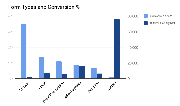
As we can see, not all forms are made equal!
Form Type and Motivation
Let’s look at potential reasons for these results.
- Contests have by far the highest conversion rate, and this is no surprise. Entering a contest means that you have the opportunity to win something. People love free stuff.
- Surveys are usually designed to collect feedback. The data doesn’t talk at all about the motivation for filling in the surveys. For example, rewards for filling in surveys, or where surveys were in the sales funnel can impact the conversion rate.
- Event Registration, Order/Payment, and Donation forms allow people to do things they want to do (attend events, pay for something, or donate).
- Contact forms have by far the lowest conversion rates. One possibility is that people are going to contact forms to get contact information, and if they can find the email or phone number on the form page, there is no need to complete the form.
It’s clear that not all forms types are made equal. You’re probably designing a specific kind of form, but it’s worth considering methods you can use to motivate people to fill in your form.
Increasing Motivation
There are two things that you can do increase a user’s motivation to fill in a form:
- Make the value proposition obvious.
- Give them something they want or need.
Make the Value Proposition Obvious
If you offer the most amazing product or service in the world, but nobody knows what you’re offering, you won’t be in business long. This logic applies directly to forms: if you’re offering an amazing product or service in return for filling in the form, but it’s not obvious, it’s unlikely many people will fill in the form. Your job is to make the value proposition obvious.
Two ways to make your value proposition obvious are to write excellent form headlines, and to write compelling button copy on the form’s button. The next post in this series examines the importance of these two things, and how to improve your form’s copy.
Give Users Something They Want
Rewards incentivize users to fill in forms. Giving people things they want, like a free trial of a service, a free/discounted e-book, or a free quote are examples of things you can do to motivate users. The more valuable the reward, the more likely that users are willing to do more work to get it. If you are offering a draw for a dream home with great odds, I’m likely to spend weeks filling out your forms. If you’re offering me an old piece of cheese, and I have to pay the shipping, I’m probably not going to spend any time on your form.
Perceived Cost (a.k.a. “What’s it going to cost me?”)
There are three types of costs that a user incurs when filling out a form:
- Time
- Effort
- Information (privacy)
A good form designer tries to reduce the perceived cost of each of these things.
Time
The perceived time required to fill in a form is the easiest assessment for users: if a form looks really long and complicated, it’ll be perceived as requiring more time to fill in (said nobody ever with surprise in their voice). The primary factor related to perceived time required to fill in a form is the number of form fields.
Form Length
The most common advice I came across when researching form design is to keep your forms short. The advantage of keeping forms as short as possible is that the perceived time required to fill it in is very small. Though in general keeping forms to the minimum required information to generate a lead is a good idea, the shortest form is not necessarily the best form, as I discuss at length in the third part of this series.
Multi-step Forms
Another way to keep the perceived cost down is to use multi-step (or multi-page) forms. If you find that displaying all of your form fields on one page is overwhelming, using multi-step forms might help. Displaying 5 - 7 form fields on a single page is one recommendation, however I was unable to find any studies validating this. By showing a smaller number of fields on the first page, the form looks shorter and cognitive load is reduced. For a more detailed discussion on multi-step forms and related studies, please read the third post in this series.
Effort
The perceived effort required to fill in a form relates to the types of form fields and the overall UX of the form. Certain types of fields, such as textareas, have been shown to substantially lower conversion rates if you have more than two of them. One possible reason for this is that textareas are perceived to require more effort to complete than other kinds of fields. Generally speaking, single line text fields require users to enter factual information: your name, your email, some part of an address, etc. Textareas, those multi-line text boxes, often require users to think to fill them in. The more thinking users have to do, the higher the perceived effort required to complete the form. I discuss research related to the effects of different form fields in part three of this series.
Information
Not all types of information are valued equally by users, nor is privacy valued equally by all users. This means that without specific information about a user, the exact information that a person is willing to give up in exchange for a given offering is highly variable. However, some studies that have shown that asking for certain types of information can harm conversions. Asking for phone number, age, and address fields have all been shown to reduce conversions.
Summary
Whether or not a user fills in a form comes down to a simple cost-benefit analysis. Users weight the perceived benefits against the perceived costs, and if the benefits outweigh the costs, they are likely to fill in the form. It’s your job as a form designer to ensure that you do all you can to increase the perceived value of the form, and reduce the perceived cost (in terms of time, effort, and information).
Ambitiously, I’d love to be able to define an equation for expected conversion rate for form design. Something that could calculate the expected conversion rate based on perceived value (form type and motivation) and perceived cost (length and layout of form, types of information requested, etc.), but for now I’ll settle for being more in-form-ed (groan) and having a better way of thinking about form design.
Form Design UX Series
Part I: User Motivation Part II: Increasing Perceived Benefits Part III: Reducing Perceived Costs