More UX design considerations for virtual reality
Since VR has come so far in such a short time, there’s still a lot that we just don’t know about design “best practices”. For example, in my last post I told a story of how one of our lab members accidentally walked into a tree in the virtual environment, and spilled some coffee in the real world while bracing himself for the impact (which obviously never came). Safety, possibly for the first time, is a design consideration for UX in virtual reality! In this article, I’m going to talk about some other significant ones.
The interface
There are two components in a VR application: environments and interfaces. The environment is the virtual world itself (e.g. a suburban neighbourhood), while the interface is a set of components that users can use or interact with to control the environment in some way. Some VR applications might have almost no environment and a lot of interface (picture a VR application where you’re navigating a series of menus, not dissimilar from an existing mobile application). Other VR applications, like the traffic safety training game we developed at the CDRU, might have a complex environment and almost no interface at all.
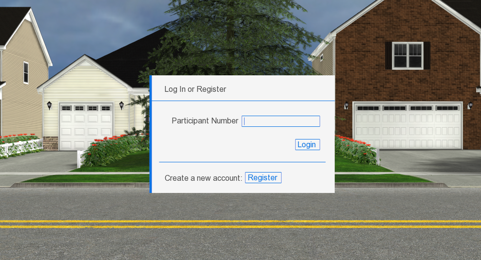
Our training game’s interface was only visible as the application was booted up (to allow participants to sign in to their account), and to select the training stage they wanted to use. The first consisted of a simple form, and the second was a simple menu consisting of a handful of buttons. In some VR applications, the user may interact with the interface using their hands with tracking technology such as Leap Motion, or with controllers such as the ones included with the PlayStation VR or the HTC Vive. These choices come with a lot of their own design considerations, which I won’t get into here. In our case, because the users were always sat at a desk with an Oculus Rift, we allowed them to simply use a mouse.
This, frankly, felt a little odd, and is probably not an ideal solution for more complex interfaces. However, since our interface was so simple, and because a lot of the time it was a research assistant actually keying in the information using a nearby monitor (which mirrored what the user was seeing), the mouse served the purpose.
Another choice we had to make was where to place the interface itself. Because there was only ever the one interface element visible on screen at a time, we decided to lock it to the middle of the user’s vision. This meant that wherever they looked in the environment, the interface would follow them and appear in the middle of their vision. Once they signed in and selected their stage, it would disappear. If your VR application has a more complex interface with a number of different elements, you’d likely be much better off taking advantage of the wide comfortable viewing space afforded by modern VR headsets, and allow the user to turn their head to look at whichever elements they’re interested in.
We tried to place the interface at a comfortable viewing distance for the user. You can see a great demonstration of comfortable viewing distances in this Michael Alger video. One issue that we had, and that more text-heavy interfaces may struggle with, is that UI elements (and particularly text) will tend to look pixelated and blurry, because of the relatively low resolution of current VR displays (considering they’re right up in your eyeballs). This may just be something that designers have to accept for now.
While our interface was quite simple, we had a number of much more complicated design decisions to make as far as our environment was concerned. For more on that, it’s time to address one of the elephants in the room when it comes to VR: motion sickness.
Motion sickness
Motion sickness was by far the biggest design issue we ran into while building our training game. There are a number of reasons why motion sickness is a problem with VR headsets, and not everyone agrees on the root causes, so I’m not going to get into all of them here. The two issues that we ran into most prominently were responsiveness and cue conflict theory.
Responsiveness
Without getting too far into the details, it’s considered a best practice for your VR application to be highly responsive, meaning high frame rates and low latency. Oculus has recommended that applications run at a minimum of 90fps. For the PlayStation VR, Sony is refusing to certify games for the PlayStation VR if they drop below 60fps at all. This means that, if there has to be a trade-off between graphical fidelity and a high frame rate, the high frame rate should win out.
Before the Oculus Rift arrived at our lab, our game was running at 60fps (because we were using VSync with monitors running at 60Hz during early development). When we first started to run it on the Rift, we found that we weren’t getting close to our targeted 75fps. The increased FOV of the Rift meant that our engine was now rendering more on the display than was visible before, so we were often struggling to even hit the 60fps that we were achieving previously.
This meant that we had cut back on our graphics output. We went back and optimized our 3D models again, removed details from our virtual environment entirely (our trees and shrubs were especially resource-intensive to draw), and stepped up our level of detail game. We had to step down our graphical fidelity to make sure that our system ran at the recommended frame rate. At least for the time being, VR applications may just have to live with having less impressive graphics.
Cue conflict
Cue conflict occurs when there’s a mismatch between your perception of motion in the virtual world and the real world. For example, if your digital avatar moves around the virtual environment while you’re sitting still in a chair. In our training game, whenever the user made a mistake in crossing the street (such as failing to look both ways before beginning to cross, stepping into the street too close to an oncoming car, etc.), they would be stopped, shown a replay of what they’d just done wrong, and what they could do to fix the problem.
This system worked well when the users were sitting in front of a computer monitor in early development, but with the Rift it became a motion sickness nightmare. When the replay started, the user’s perspective was being shifted around between replay angles, and it became extremely disorienting. I often couldn’t sit through more than a couple of replays without having to take an extended break. Rapid movement, particularly without user control, is a great way to make people feel sick. You have to try to match the user’s sensory expectations.
At first, we weren’t sure quite what to do about this. The replays themselves were important for the training aspect of our game: to show the user exactly what they did wrong and how to correct it. One fix we (briefly) considered was using a virtual nose which had shown some promise in academic research.
However, our solution to this problem was actually fairly simple. When the user was wearing the Oculus Rift, instead of having their perspective shift along with the replay, a screen would appear in the middle of the street in front of them, with the replays projected onto it, and the user could then simply turn their head and look at the screen. If anyone remembers drive-in movie theatres, it wasn’t unlike that. Because we were no longer forcing the user’s perspective to shift quickly, independent of their actual physical movement, this solution proved to be quite effective in combating motion sickness.
Of course, it was possible for the user to simply choose not to look at the replay screen. Helping us out here was the fact that, because the replay screen appeared directly in the middle of the user’s comfortable viewing space, and our attention is naturally drawn to movement, it was natural for the user to want to look at the replay screen anyway.
Wrap
These are just a few examples of design considerations in VR development that can significantly improve the experience of your VR application. I may write more about VR development in the future, because this is such an exciting time to be (virtually?) alive, and it will be fascinating to see how designing for VR headsets evolves over the coming months and years.
(A version of this post originally appeared on my personal blog)