Creating Fully-Responsive Framed, Matted Pictures Using CSS
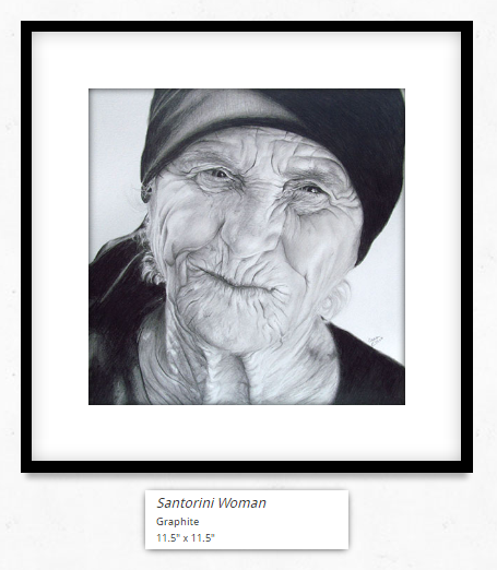
We recently redesigned laurenellis.ca for the incredibly talented portrait artist Lauren Ellis. She wanted her art displayed as it would be in an art gallery: beautifully framed and matted, with professional-looking artwork labels underneath the art. In this post, we’ll show you how we created the frame and mat using CSS.
We had the following requirements for displaying the art:
- art should be framed and matted
- the frame, mat, and image are responsive
- at all page widths, the frame and mat must be the same size relative to the size of the picture
Inspired by this gallery, we set out to create a beautifully framed and matted art gallery.
Simple, semantic HTML
This is the HTML we will use to create framed and matted art:
<div class="frame">
  <div class="mat">
    <div class="art">
      <img src="...">
    </div>
  </div>
</div>
Choose the frame and mat size
For our example:
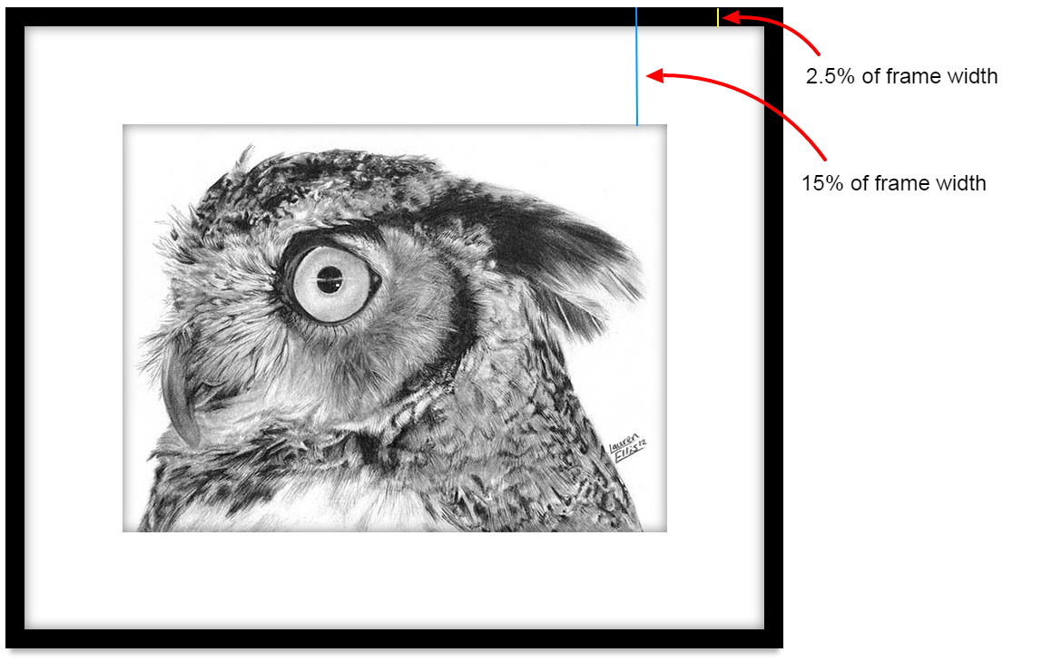
- distance from frame to art is 15% of the frame width (on both sides)
- distance from frame to mat is 2.5% of the frame width (on both sides)
frameToArtPct = 15%
frameToMatPct = 2.5%
Get the aspect ratio of your image
First we’re going to select an image to frame. For this demo, we’ll be using one of Lauren’s pencil portraits, a horned owl. This image is 600 x 450, so in our example, the aspect ratio is 4:3.
apsectRatio = imgWidth / imgHeight
We’ll be using this aspect ratio when making our frame. One thing about using this method is that you need to know the aspect ratio of the picture you’re framing, but you can get that from the image itself before rendering the page (on laurenellis.ca we use javascript to calculate the aspect ratio and padding).
Create the frame
We create a frame by creating a div with a black background. Eventually we’re going to add a mat and an image inside it, but for now, we’ll just make the div.
.frame {
  position: relative;
  width: 100%;
  padding-bottom: 82.5%;
  background: black;
  box-shadow: 0 10px 7px -5px rgba(0, 0, 0, 0.3);
}
We’ve set the width to be 100% of the parent container, and the background to black (it’s a black frame). Adding a box-shadow underneath gives the frame depth, creating the illusion that the frame is hanging on a wall. We set is position to be relative so that our sub-elements, which will be positioned absolutely, are set relative to the parent.
padding-bottom is used to accomplish two things: first, it allows us to show the correct image height before rendering the images are loaded. Secondly, and more importantly, it allows us to maintain the aspect ratio of the “frame” (i.e. the black div behind the mat) when the page is resized.
It’s easy to make the width of a container responsive by setting the width as a percentage, but there is no easy way to set a responsive height. To get a responsive height we can use the fact that padding % is set relative to the the width of the container. In our example, we are going to make the image 70% of the frame width:
imgWidth = (1 - (2 * frameToArtPct)) * frameWidth
imgWidth = 0.7 * frameWidth
frameWidth = 600 / 0.7 = 857.14
Because the frame and the mat are equal sizes on all sides, we calculate the height of the frame by adding the same amount (30% of the width) to the image height, and can then calculate the height/width ratio of the frame:
frameHeight = imgHeight + ((2 * frameToArtPct) * frameWidth)
frameHeight = imgHeight + (0.3 * frameWidth)
frameHeight = 450 + (0.3 * 857.14) = 707.14
padding-bottom = frameAspectRatio
frameAspectRatio = frameHeight / frameWidth
frameAspectRatio = 707.14 / 857.14 = 0.825
So we know that the padding-bottom of the frame is 82.5% (i.e. the height of the frame is 82.5% of the width).
Add a mat
Next, we’ll add a mat inside the frame. The mat is just another slightly smaller div that sits inside our frame. We will create a white div (the mat) and position it absolutely within the frame. We’ll set the left and right properties of the mat to be 2.5% of the width of the frame from sides of the frame. This wouldn’t work if we hadn’t set position: relative on the frame!
.mat {
  position: absolute;
  background: white;
  top: 3.0303%; bottom: 3.0303%; left: 2.5%; right: 2.5%;
  box-shadow: 0px 0px 20px 0px rgba(0,0,0,0.5) inset;
}
Where did the 3.0303% for top and bottom come from? We know that the top and bottom have to match the left/right to ensure the mat is equal on all sides, and left and right are (2.5% * frameWidth), so we calculate what percent of the frameHeight = (2.5% * frameWidth):
matTopAndBottom = (2.5% * frameWidth) / frameHeight
matTopAndBottom = (.025 * 857.14) / 707.14 = 3.0303%
The box-shadow provides a nice touch of depth between the frame and the mat.
Add in the art
For our frame’s padding bottom to be correct at 82.5%, we have to have the art 15% of the frame width from the left edge. The art sits inside the mat, so we have to calculate what 15% of the frame width is in terms of the mat:
distToFrame = (frameToArtPct - frameToMatMat) * frameWidth
matWidth = (1 - 2 * frameToMat%) * frameWidth
artLeft = distToFrame / matWidth = 13.158%
This tells us that the distance from the edge of the mat to the edge of the art is 13.158% of the width of the mat. Now we can calculate the distance from the top of the mat to the top of the art:
matHeight = (1 - 2 * matTopAndBottom) * frameHeight
artTop = distToFrame / matHeight = 16.13%
.art {
  position: absolute;
  top: 16.129%; bottom: 16.129%; left: 13.158%; right: 13.158%;
}

.art img {
  width: 100%;
}
Setting the width of the image to 100% ensures that it is responsive.
Add a shadow between the mat and the art
The final touch is to add a shadow between the mat and the art. This final touch really makes the art pop, and makes it look very much like it does when hanging in a gallery.
Unfortunately, we can’t add a box-shadow like we did before, because the art is taking up 100% of the width of the art div, and appears after the shadow, covering it up. To combat this, we use a pseudo element to add the shadow:
.art:after {
  content: '';
  display: block;
  position: absolute;
  top: 0;
  width: 100%;
  height: 100%;
  box-shadow: 0px 0px 20px 0px rgba(0,0,0,0.5) inset;
}
Final thoughts
As you can see, this is a lot of calculations! I suggest you write a javascript function to do the calculations for you, so that you can frame pictures of different aspect ratios, in different sized frames.
We found a simpler method of creating frames with mats, but it didn’t meet all of our requirements. Specifically, the border size is fixed and set in pixels. As the image is resized, the border doesn’t maintain the aspect ratio, so if the page is very wide the border looks “thin” and if the page is small (i.e. mobile) the frame looks very “fat”. For some applications this is fine, but for displaying art, the frame and mat ratios are very important.
Hope you have learned something, and enjoy your new beautifully framed and matted artwork!
laurenellis.ca was created using AngularJS, Bootstrap, CSS, and Javascript.